Using the Scatter widget#
We first import the trident_chemwidgets and the pandas lib to load our csv dataset.
[1]:
import trident_chemwidgets as tcw
import pandas as pd
[2]:
# First we import our dataset with pandas
dataset = pd.read_csv('https://raw.githubusercontent.com/tridentbio/trident-chemwidgets/master/examples/zinc_subset.csv')
dataset.head()
[2]:
| zinc_id | smiles | mwt | logp | heavy_atoms | n_rings | heteroatoms | tpsa | hacceptors | hdonors | rotatable_bonds | |
|---|---|---|---|---|---|---|---|---|---|---|---|
| 0 | ZINC000000000007 | C=CCc1ccc(OCC(=O)N(CC)CC)c(OC)c1 | 277.364 | 2.6709 | 20 | 1 | 4 | 38.77 | 3 | 0 | 8 |
| 1 | ZINC000000000010 | C[C@@]1(c2ccccc2)OC(C(=O)O)=CC1=O | 218.208 | 1.4696 | 16 | 2 | 4 | 63.60 | 3 | 1 | 2 |
| 2 | ZINC000000000011 | COc1cc(Cc2cnc(N)nc2N)cc(OC)c1N(C)C | 303.366 | 1.3150 | 22 | 2 | 7 | 99.52 | 7 | 2 | 5 |
| 3 | ZINC000000000012 | O=C(C[S@@](=O)C(c1ccccc1)c1ccccc1)NO | 289.356 | 2.0301 | 20 | 2 | 5 | 66.40 | 3 | 2 | 5 |
| 4 | ZINC000000000014 | CC[C@H]1[C@H](O)N2[C@H]3C[C@@]45c6ccccc6N(C)[C... | 326.440 | 1.5545 | 24 | 12 | 4 | 46.94 | 4 | 2 | 1 |
Once we have our data, we can use the Histogram widget to display an interactive Histogram that we can use to explore and split or subset our data set. The Histogram widget accepts the following keyword arugements:
data: the dataset in pandas data frame formatsmiles: the name of the column containing the molecular structure in SMILES formatx: the name of the column to plot along the x-axisy: the name of the column to plot along the x-axisx_label: (optional) the x-axis label to display, defaults to the string specified byxif a label is not providedy_label: (optional) the y-axis label to display, defaults to the string specified byyif a label is not provided
[3]:
# Now we can use the scatter using the mwt as x axis and logp as y
scatter = tcw.Scatter(data=dataset, smiles='smiles', x='mwt', y='logp', x_label='Molecular Weight', y_label='logP')
# scatter # Uncomment this line to run locally
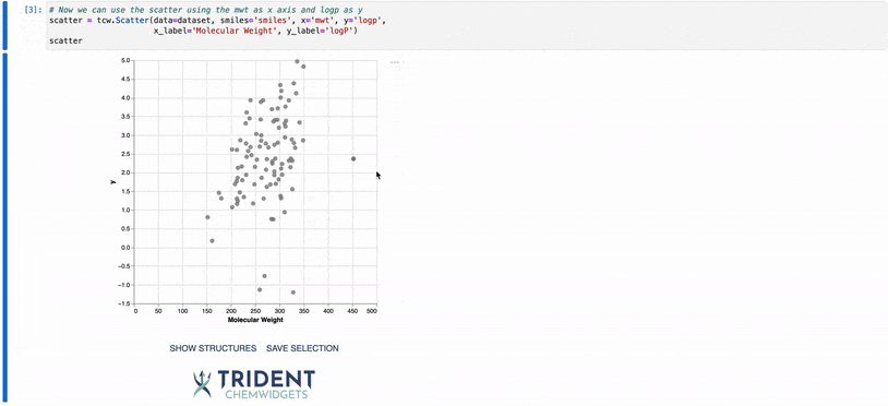
In the example above, you have several ways to visualize the structures present in the underlying plot data. First, you can hover over any point in the plot and a tooltip with the structure will appear. This can be usefull for identifying outliers in your data set.
You can also click and drag anywhere in the plot body to select a subset of the data. Your selected datapoints will be highlighted on the plot as colored points in a gray box. If you click the SHOW STRUCTURES button after you have selected the data points, a gallery of the molecular structures will be displayed to the right of the plot. If you then click SAVE SELECTION, the selected datapoints will be saved to an internal variable called selection that can be accessed as below. You
do not need to click SHOW STRUCTURES before clicking SAVE SELECTION, though the gallery of selected structures will be displayed once SAVE SELECTION is clicked.